Evaluation
I found out from my research and planning tasks that one convention of music magazines is that on the front cover they have many cover lines to show exactly what is in the magazine, I also found that they usually have a picture of the main featured artist/band on the front of the magazine. Another convention is have an interview with a new and upcoming artist/band somewhere in the magazine. Many contents pages also have a picture of someone/something featured in the magazine.
Taking all of this into consideration I feel that the front cover of my magazine has some usual conventions of a real magazine as it has a big and bold title which is the name of the magazine this is so people will see it and hopefully remember the name so they are likely to think of it when they want to buy a music magazine. Another convention of a real magazine that it has is that it has a picture of the person the main article is about; this is often seen on almost all music magazines, especially VIBE.
I feel that the fact that my magazine also uses a lure is another way in which it uses a common convention;

The picture above shows the lure, and because the magazine offers something free which is in this case a free music download, aimed at the target audience, they should be more likely to purchase the magazine.
Another common convention used is the cross media convergence; this is because just above the barcode, the magazines website 4tunes.com is advertised. One way in which my front cover may challenge the conventions is the fact that it has fewer cover lines this is because I feel that sometimes a magazine can have too much writing on its front cover which can then take away from the picture. Due to this I used less cover lines and headings.
By using a barcode I also used another convention often seen on the cover of magazines.
The picture I used for my front cover is representative of the type of music the band is involved in. This is because the music genre is an R&B / Grime type of music, this is why the backdrop is of a slightly dirty, or grimey place. It also looks like it could be in a more industrial, inner city place which is where the band originates.

As you can see from the picture above I also used many props to make the model look more suited to the type of music, this is why the flat peak cap was used as it is commonly worn by R&B artists along with the glasses which are also now becoming popular. There are also the more expensive looking props such as the watch and of course holding the dollar bill again to represent the wealth of the artist.
Another convention I have used that is similar to existing magazines is by having a banner across the top of the cover with the names of bands appearing in the magazine;
This is again similar to what is often seen on the front cover of VIBE magazine.
In the bottom right corner I placed a symbol to represent the company logo; I created this logo using a program on the internet;

My contents page also includes many conventions often seen in other magazines such as again using a picture of something featured in the band in this case some of the band members from the band used for the interview.
Another convention that isn’t so common is as well as placing the contents vertically down the page so readers can see what order and pages everything is on; I also placed one of the contents in a bigger font and separate from the other contents as well as placing it in the contents. I did this on two occasions to show firstly the free download as I believe this may be the reason some people buy the magazine, and secondly to show the interview with the band, as this is the main feature in the magazine and is likely to attract more buyers.


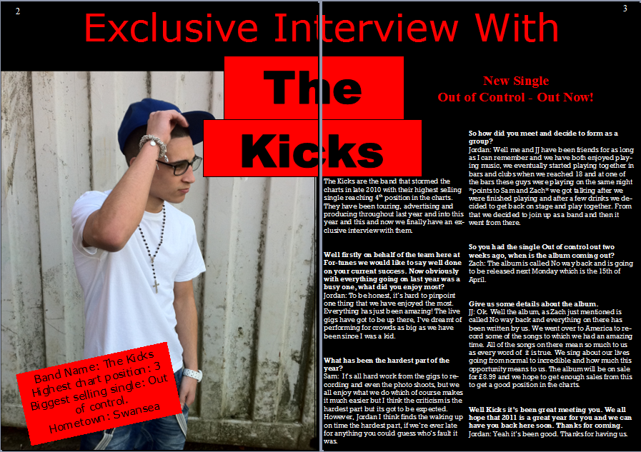
The double page spread in my magazine is an interview with a band, I used a picture similar to my front cover to show the lead singer of the band in an environment similar to where the band is originally from, an inner city, more industrial area.
I placed a fact file over the top of the picture to show information about the band;

As you can see I used a small fact file as I did not want that to be the main thing on the page, it is placed over the picture in order to get the attention of the readers. This will work as the reader will most likely look at the picture first and therefore sees the fact file and be interested by it. In order to keep the fact file short I used only 4 criteria; Band name, highest chart position, biggest selling single and the bands hometown.
Another way in which my double page spread is similar to other magazines is that it has a larger heading in bold writing and a colour that will stand out, I used the colour black as I had a red background for it as red was one of the colours that was most highly chosen when I completed my survey. I feel that if the heading on the page is bold and noticeable this will mean the readers instantly knows what it is about making it more convenient for them as they can decide instantly if they are interested on what is on the page.

Another convention often seen is advertising for the band, this can often be the reason for the band doing an interview, for publicity. I placed this in the corner of the page just above the interview itself as I feel people will see it and read it before they start reading the interview;

This obviously will influence people to go out and buy the new single therefore making money for the band, and they are therefore going to become even more successful and after this it could influence more bands to be interviewed by the magazine.
I think my magazine represents my target audience, the target audience for my magazine is listeners or R&B music of all ages, however I believe the majority of people who like R&B music will be of an age such as 10-25 years old. Although I believe this is the age group which will more likely be fans of R&B I do not believe that the younger people in that audience (10-14) will be probable to go out so my target audience would be people between the ages of around 15-25 years old who listen to the R&B genre of music.
I feel my magazine represents the target in many ways, one of which is through the interview with the band, the language used throughout is representative of the younger generation as some slang terms are used. Another way it represents a social group is through the pictures used in the magazine, in all three pictures I used the flat peak cap as a prop, this is because this item of clothing is becoming more popular recently due to many R&B artists wearing them, this is therefore representative of the younger social groups as they also wear them. I think the mise-en-scene of my shots are also representative of the social groups that may be interested in my magazine as R&B music generated from a much poorer background and only recently has it become more mainstream. Due to the fact the background in the pictures on my front cover and double page spread is an industrial, grimey background, much like many places in the inner cities in which my target audience may live.
The pictures I used for my magazine are similar to those used in other magazines for example the following;

There is quite a similarity between the two pictures and the genres of music are similar. This shows I have used conventions from other magazines.

I used a similar type of cover lines and also I used similar clothing in the picture as the clothing is conventional to the genre of music.
I have used many techniques to attract my audience to buy my magazine, the main one being a lure. As one of my cover lines I showed that with each magazine you got a free download of the newest song. This will cause people to be more likely to buy it as there are many who like to think they are getting something for free.
I also think that the contradiction on my front cover will attract the audience, I used a poorer looking, dirty background but the model is holding a dollar bill. I believe this may interest people as it shows that anyone from any background has the opportunity to become successful.
I have learnt many new skills especially in photo-editing throughout making my magazine, for example the original picture I used for my contents page

as you can see the picture was taken in a normal setting, but I then edited this to make the background a block colour to fit with the contents page as you can see here;

I also used an online program on the website, www.logomaker.com I did this to place an authentic looking logo onto my front cover as many magazines have a logo of some sort often depicting the company that makes the magazine;
I feel I have progressed a lot from when I completed my preliminary task as I feel my preliminary task looks much scruffier and less thought out whereas my final production piece looks much sharper and also looks as though it has been well planned. I think my photo-editing skills have improved also my use of more tools and programs such as the logo maker online.